El Camino Travel
ART DIRECTION / BRANDING/ SOCIAL MEDIA / ILLUSTRATION
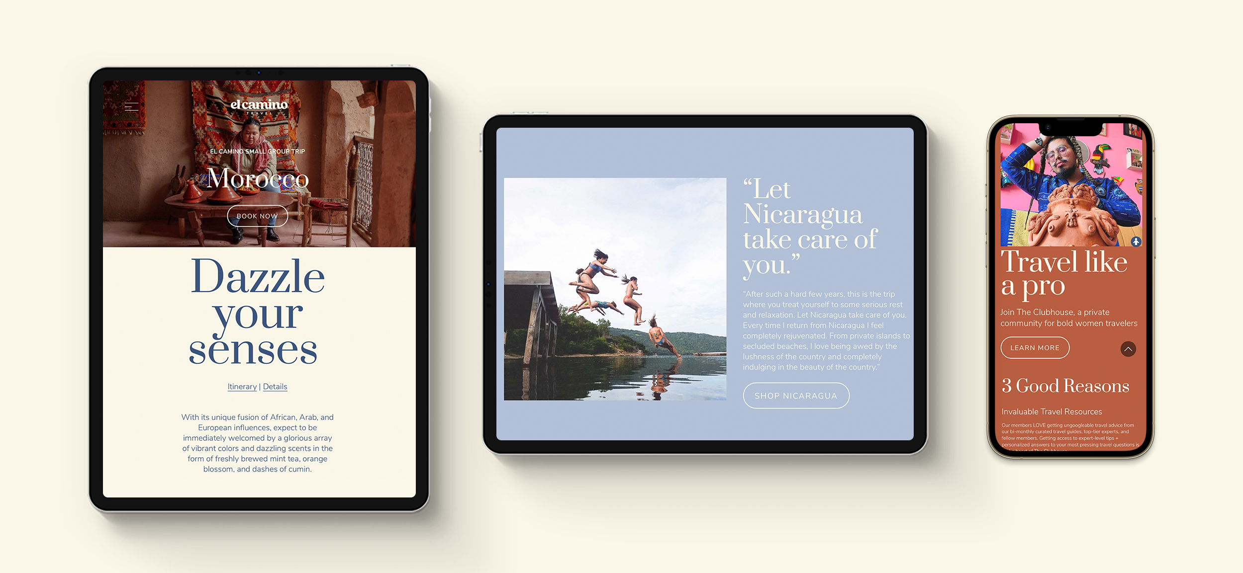
El Camino’s new look is evolving to fit the times and all the exciting and surprising places this new era has taken us.
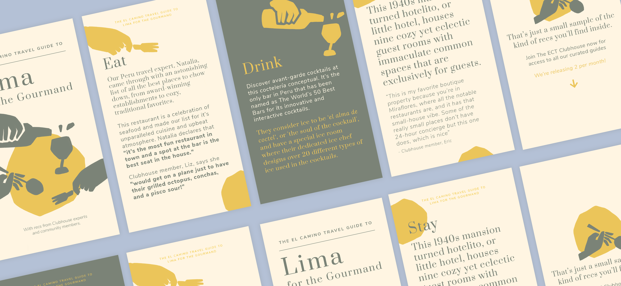
Before, El Camino’s branding was pretty simple and playful because it was just a companion to the experiences of small group trips. Within our current reality, we needed a visual language with more presence that could make digital user’s experiences easier, and more practical. With these new platforms, new possibilities have opened up, and we needed a more versatile and scalable look that could grow in different directions.
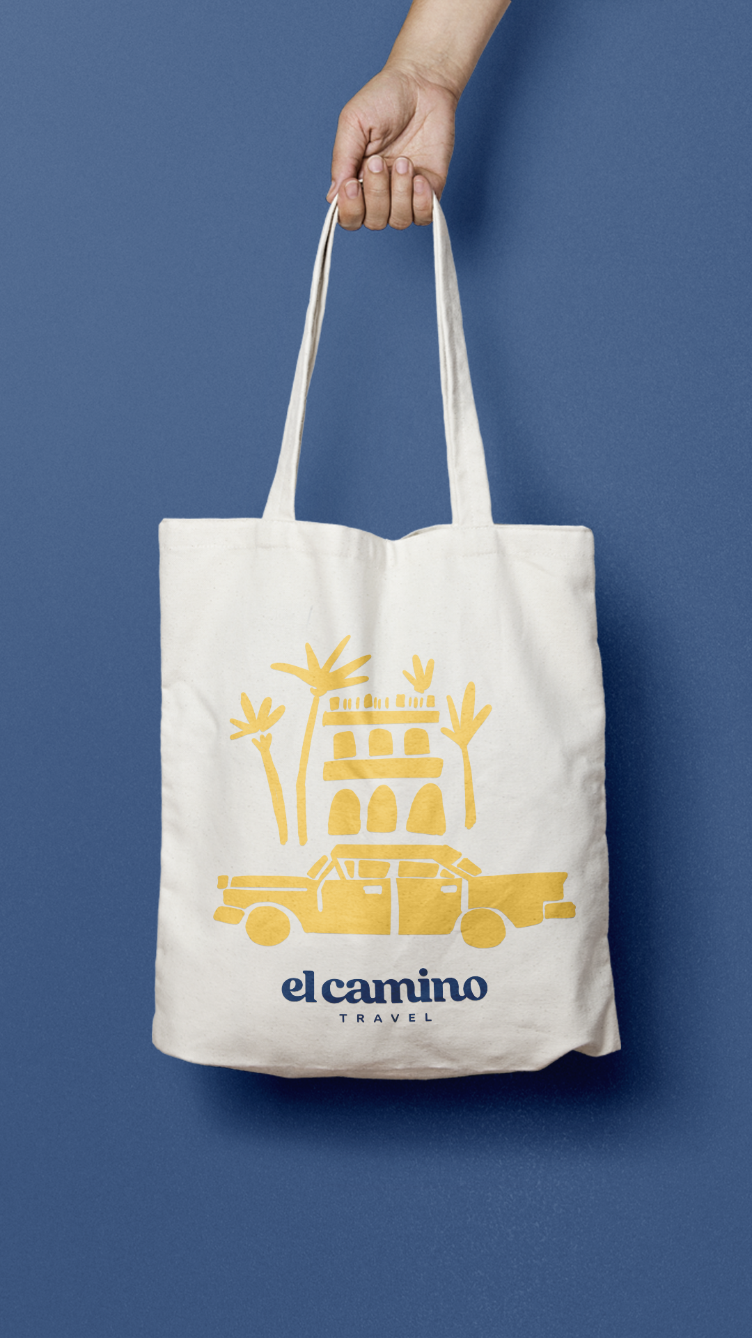
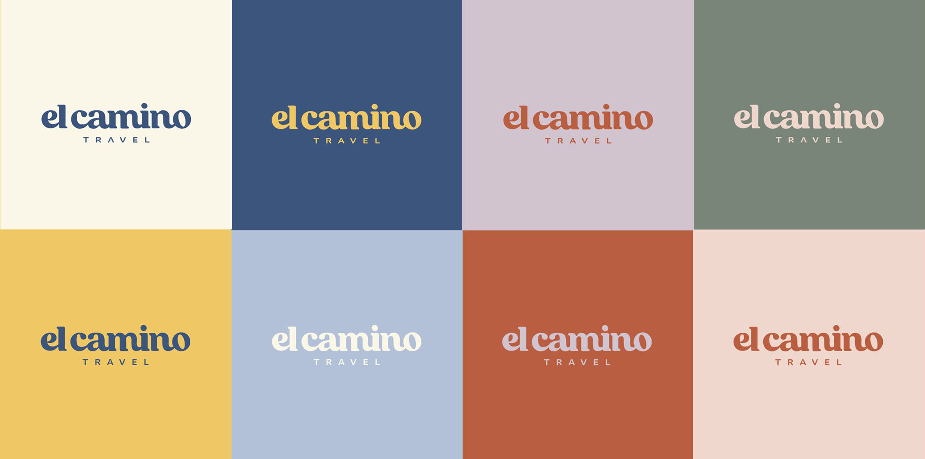
The new logo is based on a rounded serif font where the letters are connected to one another. The word mark's intention is to convey the feeling of meandering, and exploring while being connected. It aims to reference the bridges created by travel and community, while also referencing the idea of "camino" (Spanish for path- a winding road). It's slightly quirky, with hand-crafted imperfect details to keep the playfulness of the brand’s personality while remaining modern and timeless. The serif fonts add a decent feeling of femininity without feeling overpowering. The new style is still playful and edgy at times. The color palette was created based on our previous one, with less saturated tones and adding a wider range of colors to be able to communicate a more global range of moods (and destinations!).