
ART DIRECTION / BRANDING/ SOCIAL MEDIA
PINDA
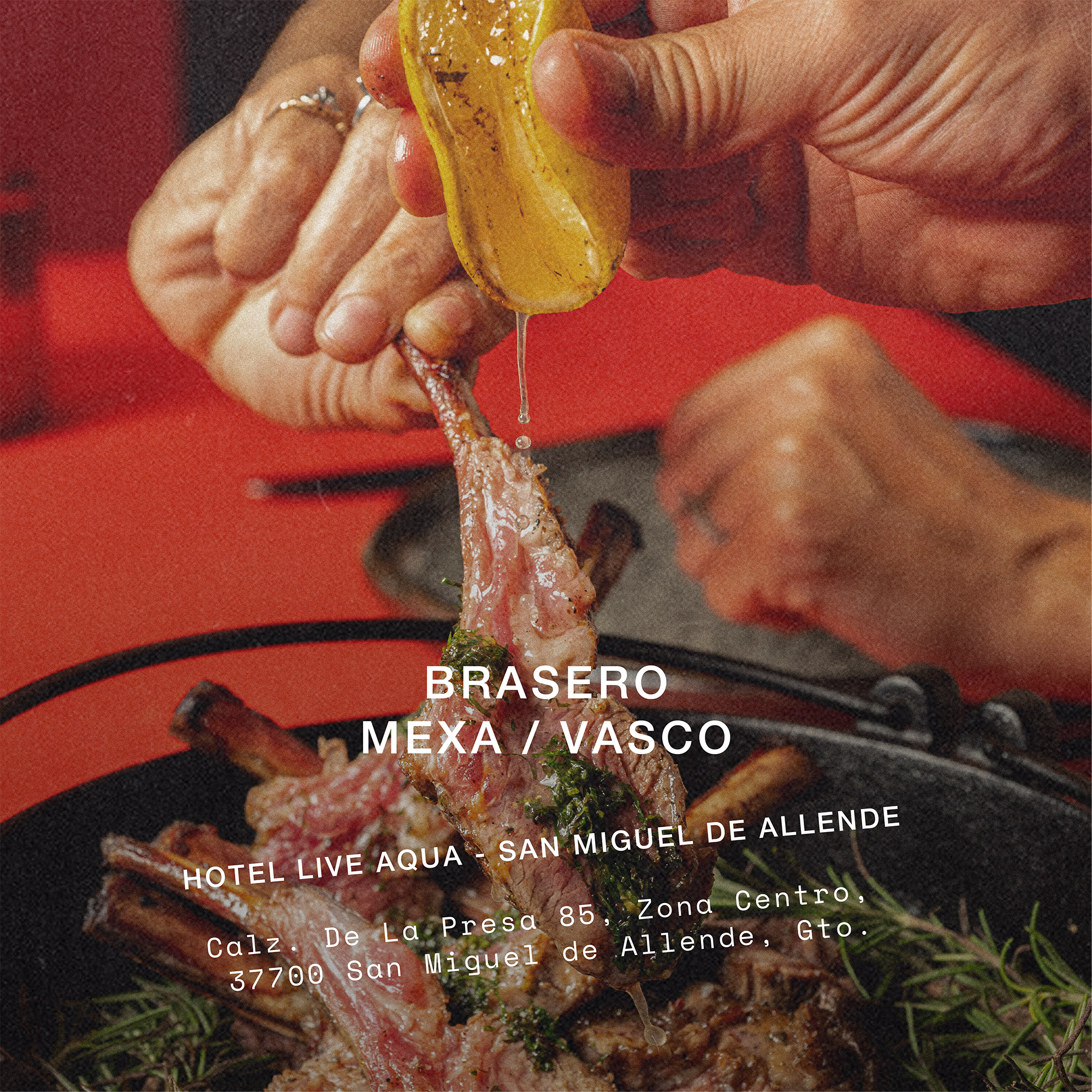
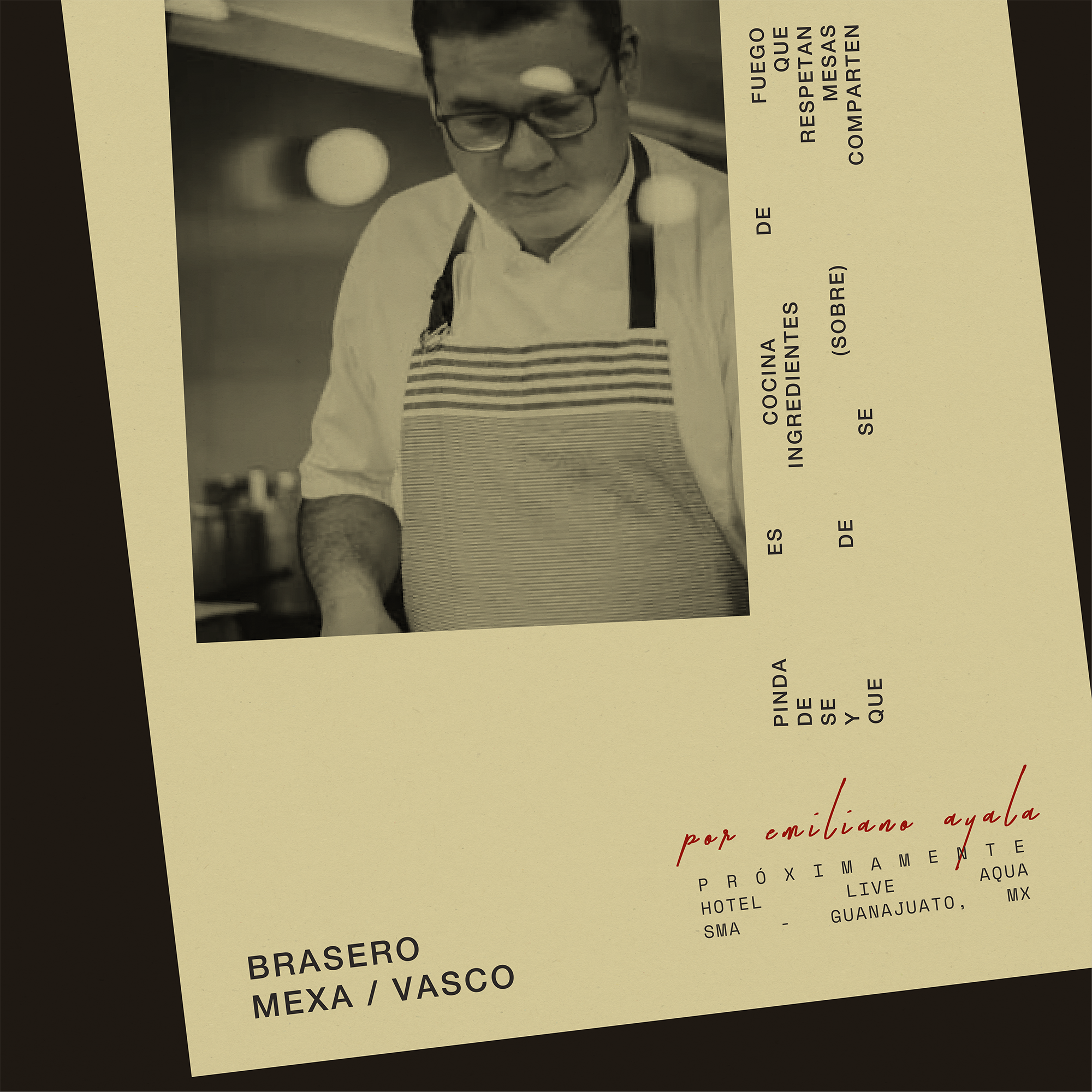
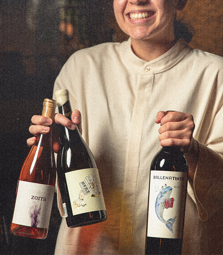
PINDA is chef’s Emiliano Ayala’s newest restaurant in San Miguel de Allende.
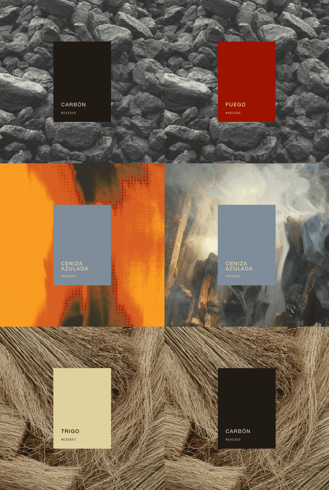
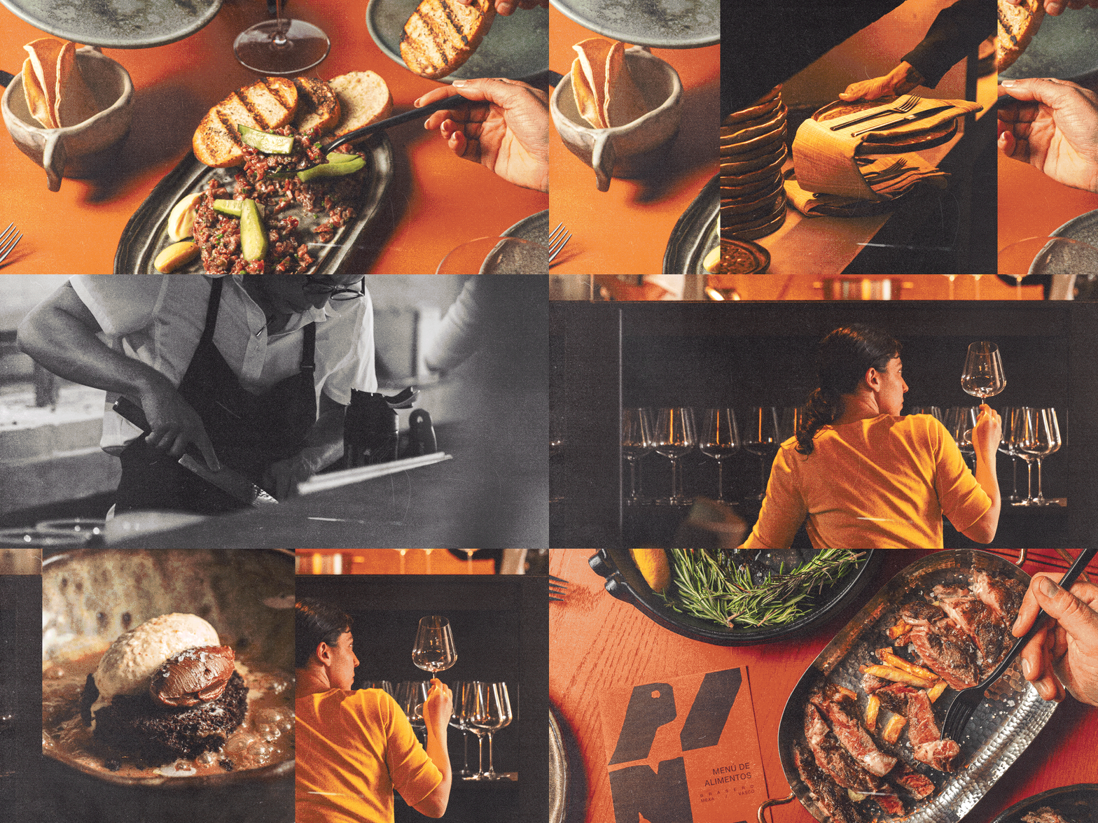
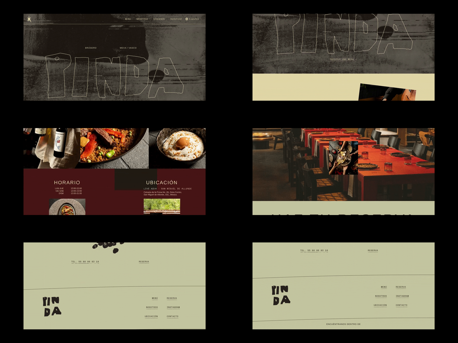
It all started with the idea that fire consumes everything. It turns colors, textures, and flavors into something new. It’s red, but also white and blue at its hottest. We wanted the identity to feel like it had been through that.
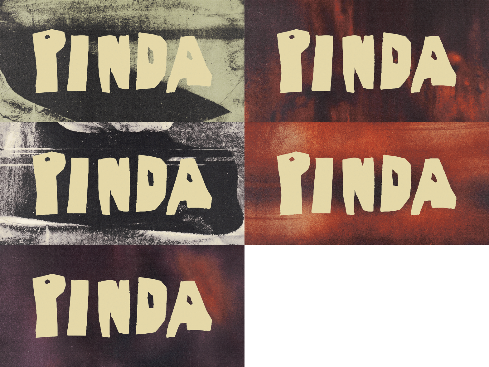
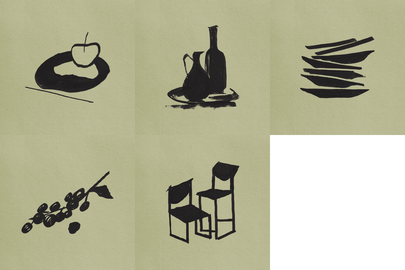
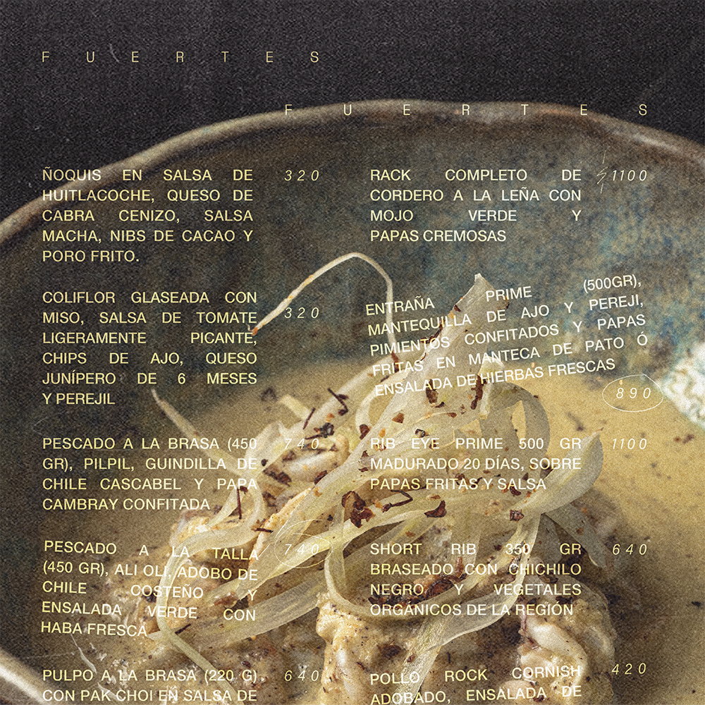
Pinda is all about the burn marks, charcoal stains, unglazed clay, ash. The logo is cut and hand-made, it’s rough on purpose. Every element of the branding is meant to show signs of the process and celebrate the imperfections that come from that, not hide them.
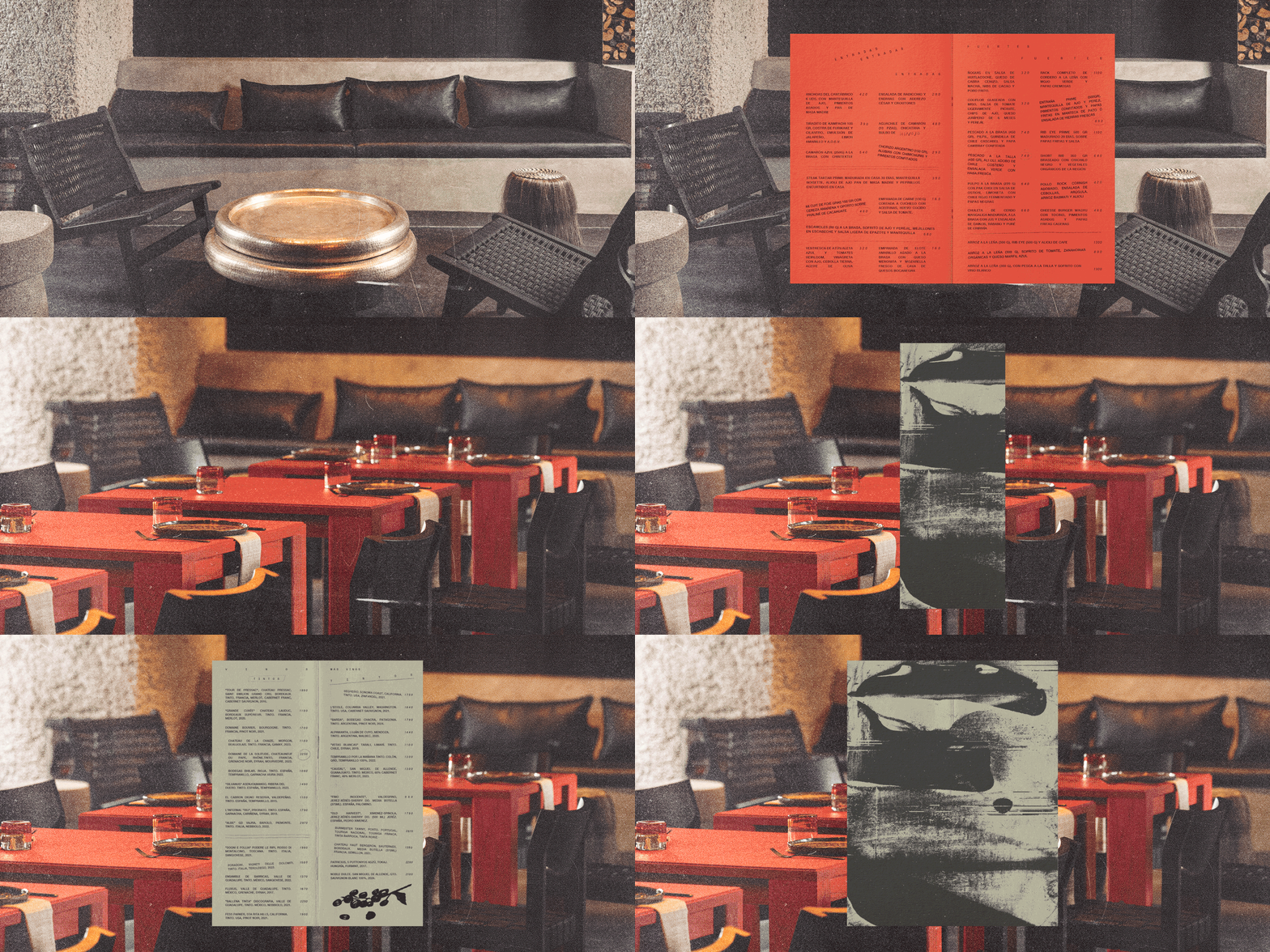
We worked alongside interior design studio @ballista.space , so the brand and the space shared the same raw, brutalist language. Rough on the outside, warm and generous on the inside.
We can work together too!
Do you like what you see?